
 We all have our personal choices when it comes to choosing our web design or layout, and we should respect that. There are countless information out there that will suggest you the best practices on how to set up your website. On the other hand, there are also those that are not highly recommendable.
Some 15 hours ago, I posted this question on Mahalo Answers.
“Website Design – What annoys you more? – In your opinion, what are the most annoying “things” that will drive you away, when you land on a website or blog? Pop-ups, Ads, Widgets, you name it. If possible, please tell me why?”
Considering the amount of answers received and the average response time, it is reasonable to conclude that there are certain things that in fact annoy a lot of people when they visit a website or blog. Such annoying things, will not only drive them away but can also get a website flagged as a “do not visit ” website, by potential visitors.
Following below, are real opinions, about the most annoying things that were unanimously mentioned, while responding to this question. For each annoying thing, I have picked the best answer(s) and reprinted them here in full.
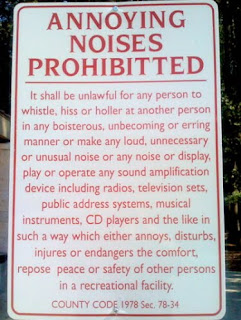
1) Sounds – Unwanted Music, Videos, and anything else that makes a noise.
“The thing that bugs me the absolute most are automatic video or music players. I often surf with my headphones on, and I’ll be listening to my peaceful music or my meditation stuff, and the **BLAM**, I get blasted with someone else’s music, usually loud, usually irritating, with no really quick way to turn it off and I have to rip the headphones off and then find the ‘off’ switch, assuming it even has one. Hate that!”
“Ads with sound: The worst is siting up at night navigating web pages when suddenly an ad trumpets “You’ve just won an Xbox 360*” – *just spend $500 on our partners to claim your prize . . .”
“Any noise that I don’t ask for annoys me, I only want to hear sounds when I click a “play” button. Often I have many tabs open and if one starts making noise its irritating to have to find where the noise is coming from and how to stop it, a lot of these sites hide their “mute” buttons in odd spots.”
2) Intext Links, Roll-over ads, Mouse-over ads
“Roll-over ads: These are the ads that start huge and roll into a corner or ads that expand upon rollover, these ads are very distracting and I have to remind myself to avoid them as I navigate the page.”
“Those mouse-over ads… They usually cover the text I’m reading on a particular website. (Hate them)”
3) Flash Animations, Animated Text/Ads
“If the first thing I notice is a great deal flashing or animation, I usually click away. This often includes flash pages. I find that movement and animation distracts me from reading textual content and I am rarely willing to wait through a lengthy load time if I don’t already know that it is worth the wait.”
“Flash animation intro screens also irritate me. I want to see the site. For the most part, no one really cares how fancy your flash intro is. The attention span of the average internet user is so small, you have only a few seconds max to grab their attention and keep them from clicking off – don’t want it on a flash intro when people are seeking information or answers to their questions.”
“Animated ads – Ads that roll through a silent animation once or upon mouseover are not too bad, but if I am trying to enjoy a page, an ad with constant motion really is a distraction and an annoyance.”
4) Pop-ups, pop-under, browser resizing, RSS subscription, freebies, etc.
“If the site automatically does anything to my browser other than load text and images, I click away before it finishes loading.”
“If the site requires me to register, give an email address, take a quiz or otherwise provide any info about myself before I can see the content I click away. I can understand offering extra perks for members, but I won’t provide a scrap of data about myself until I know the site has something to offer me. On rare occasions I’ll use BugMeNot (see source) to gain access without registering if I really want to read a particular article.”
“Popup ads. I hate those popups. 🙁 They’re really irritating. I dunno why they’re even invented. XD”
“Pop ups are irritating, but my pop up stopper stops them all now, so I’m guessing that they are really more a waste of time than anything.”
“…automatically spawning a new window (pop up/under, forced yes/no dialog box etc.)”
5) Load time, Page Speed
“If the page takes a long time to load or respond to clicks and I don’t know what it is doing or why it is taking so long, I immediately leave the page. I don’t know if it’s trying to run a nasty script, load me up with spyware or is simply having server issues. Buttons leading to long load times should be labeled with a warning, such as “High resolution image may take time to load”, or “Uploading your information could take up to 30 seconds”. I don’t want to load 15 megabytes of photos unless I first know that I am entering a high resolution photo gallery and have an idea of what to expect.”
“Websites that consist of so much stuff that it becomes difficult to load the page quickly and the page becomes too cluttered thus making it difficult to navigate.”
6) Navigation Structure
“Navigation problems is what I find most annoying about website designs, not necessarily in the way the menu layouts are setup, but more specifically when it comes to not being able to locate information. When it gets to the point that a website is not user-friendly, then there is no reason to return to the site again.”
“I am always impressed with simple web design where everything is organized, easy to find and read. I do not want to have to scroll down half the page through ads, images or videos to find content or useful links. Even if there aren’t any ads or such in my way, I still come across websites where links are not placed in an organized way (or are scattered) and it just takes too much time having to search for what I need.”
7) Color Schemes, Background images, etc.
“If the site uses a low contrast color scheme I click away. There are probably 50 other web sites out there that have whatever information I need and I’d rather spend 10 more seconds finding one rather than get eye strain trying to read text that blends in with the background. I don’t care what color scheme they use (even yellow text on black background is fine with me) providing that I can read it without effort.”
“websites where the background image is overpowering to the point where content is difficult to read makes me want to leave that site.”
8) Content
“If the page does not have considerably more content than ads, I leave. I assume that it’s some sort of scraper site hoping to get money from clicks and isn’t making a serious effort to provide what I am looking for.”
“What a great question, and of course there are many things that annoy the heck out of me, but the worst are those long long long sales pages that are responsible for wearing out the wheel on my mouse, I start scrolling and it just seems they go on for ever. I will measure one, one day and I will bet they are usually more than 20ft in length LOL. These types of sales pages are usually the ones that include pictures of money falling from the sky, boats, flash cars and big houses – like we are going to believe all of that bull…”
A good reminder:
“I treat the internet as a universe of infinite choices. It is rare for me to encounter a site that provides content that no other site on the web offers, so I just don’t see the point in spending more than 3 seconds on a site that annoys me. If you are in a massive Las Vegas buffet line with seemingly infinite choices, you don’t reach for the stale item, the wilted salad or the questionable sushi because there are so many more appealing choices that are less likely to make you sick. Staying with an annoying site simply doesn’t offer enough benefit for the potential risk of wasting your time or getting hit with as hostile script.”
Sorry for this long post. What say you? Is there something esle that annoys you and are not included here?
Related Posts
 Droodly: Buy And Sell Any Advertisements Via Auction
 DiTesco’s iBlogZone Is For Sale
 What You Do Not Know About Malware May Hurt You
 Link Building Lust, Olympics 2012, FamousBloggers, Speedlink 30:2012
 Komoona AdSense Companion: Double Your Chances To Make Money
 6 Things You Thought about Social Media Which Just Isn’t Right
 WebMeUp: An All-in-one Web Based SEO App That’s Gaining Traction
 Best WordPress SEO Plugins For 2012
Comments are closed.