
All good things must come to an end.
This is the story of the growing trend of print magazines such as Newsweek that are shutting down their printing presses after generations of production.
If you want an idea of why, all you have to do is think about the massive fallout from Google shutting down its popular RSS reader.
There was clearly more people upset about Google Reader getting canned than there were people complaining about Variety Magazine’s decision to go online only.
There’s a reason for this.
Magazines are popular because they feature content that’s much MORE RICH than newspapers and industry journals.
In that respect websites are out magazine-ing the magazines and this article is a highlight of how they do it by displaying content with awesome, eye-catching, intuitive, and beautiful design.
SPIN MAGAZINE
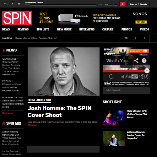
It’s been one year since Buzzmedia bought SPIN and now the new owners are finished with their “renovations of the new place” if you will, here are the top design features:
1. Persistent Music Header.
In the header there is a fixed music player that allows you to instantly play the featured song right away or browse other featured tracks. This is a great way to keep music the priority for a site that’s all about new music.
2. Persistent Side bar advertisements.
Design is the best way to integrate monetization into your site. The left and right side bars remain fixed as you scroll and display clickable banner ads to promote sponsors.
3. Premium Page Templates.
Each main page on the site features a very large main featured slider and an intuitive submenu. Stories are featured with images and short text summaries. Essentially it makes each page as important looking as the home page. This makes a very positive impression for a new visitor and makes the content seem more important as you browse.
VARIETY MAGAZINE
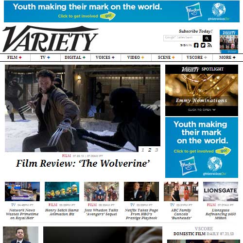
After 80 years in publication Variety magazine canned it’s print edition and went online only on March 1st 2013. There are some really cool features on their new site here’s my favorites:
1. Dynamic Persistent header.
This is cool, once you scroll down the full size header reformats itself scaling the main logo down smaller while maintaining the menu navigation. This is an excellent way to preserve and enhance functionality while also showing off really cool looking totally responsive design.
2. Multiple Featured Content sections.
This is eye catching. Many blogs become boring to the eye as soon as you realize it’s just a list of styled posts. Variety’s home page does an excellent job of breaking up the monotony by featuring content in several asymmetrical sections. Some show off the latest video clips and articles related to an award show. Others count down the top three grossing films. There is also a section where they show off their writers. It’s the contrast that catches the eye.
NEWSWEEK
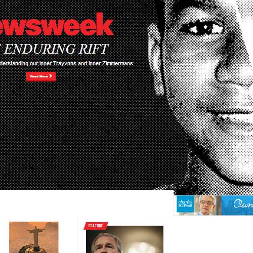
In the fall of 2012 after almost 80 years in print Newsweek announced that it was going to an online only business model. Their design team came up with some pretty freaking awesome design features here’s some of the best:
1. Dynamic Header on Steroids.
Newsweek’s new design takes the header to another level. The effect gives you a real feel of a magazine cover. The inclusion of the date of publishing furthers this effect.
2. Awesome pictures scroll.
When you click on the featured story one of the coolest features is the ability for the story itself to scroll over the full size images that are actually hidden beneath the text layer. As you scroll down little windows appear allowing you to see the high resolution images embedded underneath. This effect really dramatizes the content and adds a NEW level that I can’t remember seeing since the pop up images hit books back in the day.
3. Full width photo galleries.
On the main page there are multiple wide screen photo galleries with intuitive menu’s that really help further the storyline.
4. Load before go.
This is a cool feature that encourages you to look at a previous cover image before you can scroll down. As you are waiting an indicator with a date appears informing you of the edition that you are about to see it and remains for a few seconds until the content loads. This allows the website to control how quickly the viewer can access the content and builds up a level of excitement or curiosity while you wait.
What to do about all of this?
If you design websites or are considering redesigning your blog you should take a look at what the biggest publishers have been doing with their online only properties.
The features that they paid thousands of dollars to build can be duplicated for much less if you hire a skilled website designer.
The key is to understand that these large companies have already invested boatloads of money on research and design so you can benefit from their hard work.
Persistent headers, embedded layered images, and more are just the tip of the iceberg in the latest design trends, the world awaits your response.
Related Posts
 Ways to Gain Influence through Blogging
 7 Ways To Kill Your Blog
 Are You Maximizing Guest Posting Initiatives? Why Posting on Low Readership and PR Blogs Is Important!
 Top 5 Mistakes That Will Prove To Be A Hindrance In Your Blogging Success
 Traffic Generation and the Survival of the Dodo bird!
 Reality vs. Imagination in the World of Blogging
- How To Make Your Visitors Spend More Time In Your Blog
 What You Need To Know About Blog Commenting?
Comments are closed.