
Infographics are among the most shareable content on the web. On their own, numbers can be pretty dull, and deciphering an informational report is too much like work. Who needs that? Breaking down complex information into visual medium makes info more digestible, easier to understand, and way more likely to go viral. Here are 5 tips to create killer infographics, along with some stunning examples.
1. Ideation or brainstorming
The first task is to plan the content of the infographic. The information you share should be targeted to your audience. What are they interested in? How does this relate to your business? One great example of highly targeted graphics is this infographic about the economics of blogging from Ignite Spot Outsourced Accounting.
It’s visually interesting and colorful, contains lots of information that’s not common knowledge, and presents otherwise dull statistics in a quick-scan format. Really, 77% of internet users read blogs? Sweet! So why did Ignite Spot present this information to bloggers? The answer is right there in the infographic. There are 6.7 million bloggers on the internet, and 50% to 70% do it for the money. Most bloggers are freelance contractors, and that means many of them need…wait for it…an accountant.
The takeaway is to hit your audience where they live. Tell them what they want to know and they’ll jump right on the sharing bandwagon.
Click image to see a larger version
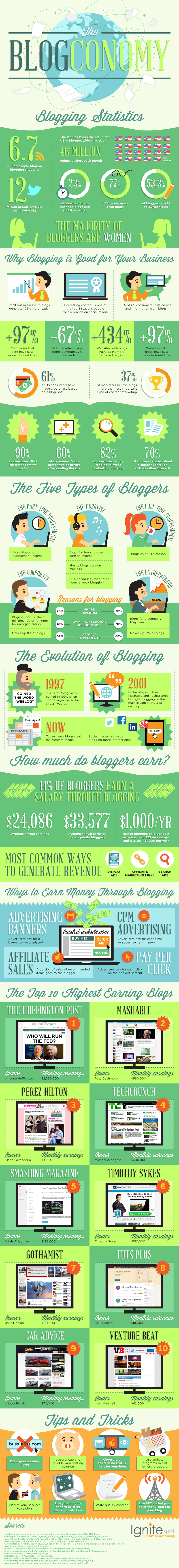
The #1 Small Business Marketing Idea via Ignite Spot.
2. Make the information interesting
Your infographic should tell a story. If the information flows naturally from top to bottom and presents a cohesive overall theme, like this one, it really drives home the point. Using a boxing analogy, Insightly lays out exactly why you need Customer Relationship Management (CRM) to manage your social contacts.
In this case, using a theme really packs a punch (pun intended). It starts by citing how many customers use social media, flows into how many customers order and interact with brands online, and ends with statistics about how many companies are dropping the ball.
Think about the power of this information. If your odds of making a sale to a returning customer are 65%, and 73% of businesses have no process to follow up with a customer after an initial sale, that’s a lot of potential business down the drain…and a pretty darn good reason to consider a CRM, don’t you think?
Click image to see a larger version

An Insightly infographic via The #1 Online Small Business CRM.
3. Choose your colors wisely
Color is both art and science, and the colors you choose impart a subliminal message to the viewer. The Logo Company put together this stunning visual on emotional response to color:
Click image to see a larger version
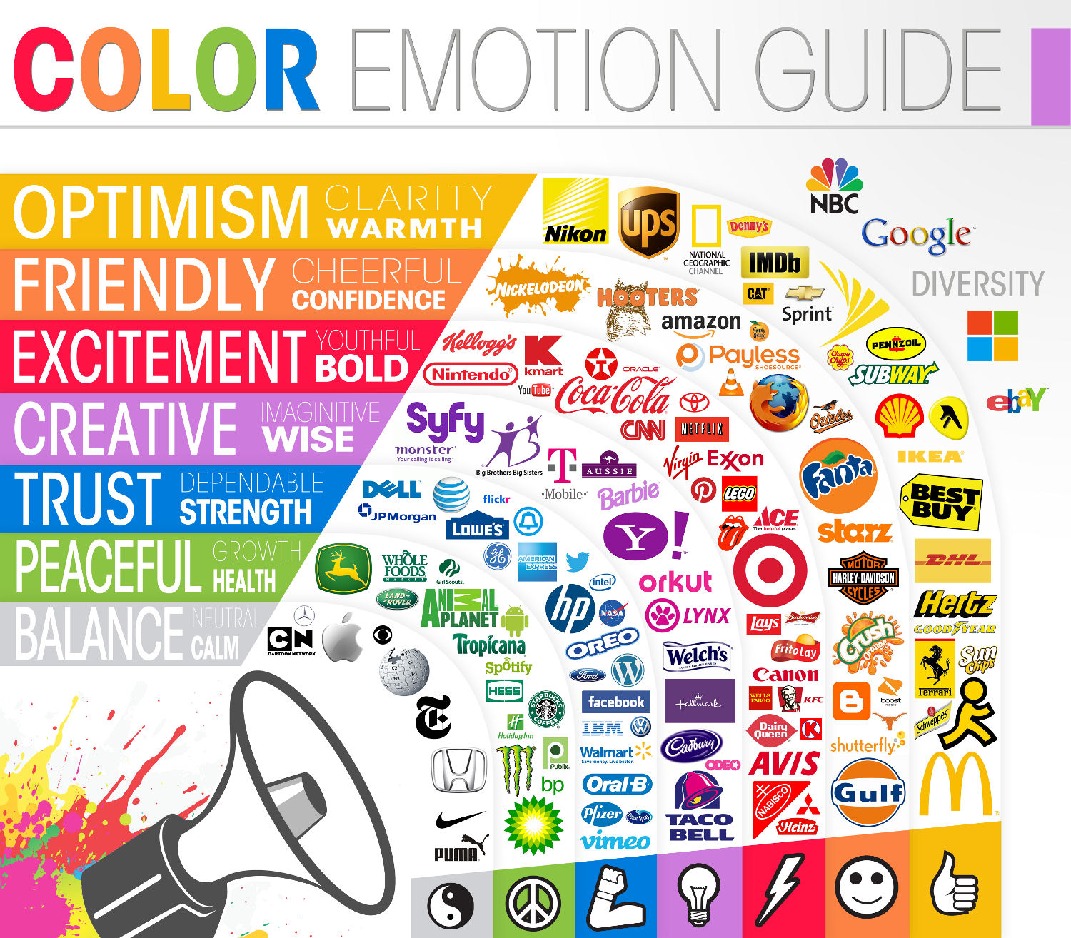
Eye-catching use of color is important to your design, but too many colors can make your graphic chaotic and confusing. For best visual effect, choose a neutral background and use pops of color to highlight points. Another visually effective tactic is to limit colors to two – either a muted background with a darker shade of the same color (brown on tan) or a high contrast pair (white on blue).
4. Focus. You can only cram so much information into one graphic.
Check out this jam-packed infographic from MediaMolecule.com. It’s fascinating, but kind of a trainwreck. Each nugget of information is given the same visual importance, and things that might be condensed to a single section with bullet points (like awards) are kept separate.
Click image to see a larger version
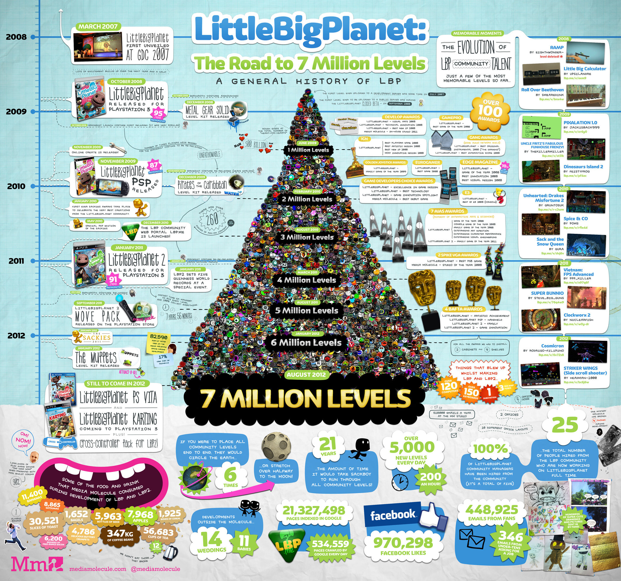
Via MediaMolecule.com.
By limiting your ideas to create a focused message, you make your content easy to understand. Readers will get the point without struggling to connect a jumbled confusion of words and ideas.
5. Make it easy to share.
This infographic, entitled The Good and Bad Habits of Smart People, has been shared more than 60,000 times on Facebook alone. ..and it’s a repost from the original source, Online-PHD-Programs.org. The framework on each page offers sharing options on nearly every popular social media outlet with the click of a button or cut-and-paste code.
Click image to see a larger version
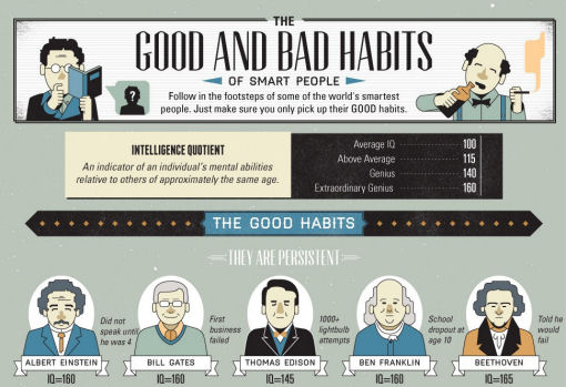
Any subject can be visually interesting. They key is to find an imaginative angle – something your customers want to know – and present it in an eye-catching way. While it should be related to your good or service in some way, the link doesn’t have to be direct. The ‘habits of smart people’ has nothing to do with getting a doctorate online, but it’s safe to say that smart people are the target audience.
Killer infographics can be powerful linkbait in the hands of people who can blend art, facts, and often humor into an attractive visual hook…or a complete waste of time on an ill-conceived idea. Make your infographic killer!
Related Posts
 Google Analytics 4 – 11 Step Migration Checklist
![15 Work At Home Tips [infographic]](https://www.iblogzone.com/wp-content/uploads/2020/05/Tips-To-Work-From-Home-Infographic-150x150.jpg) 15 Work At Home Tips [infographic]
15 Work At Home Tips [infographic] The 7 Key Trends to Watch in Digital Marketing This 2019
![Why Website Speed Matters for Your Online Store [infographic]](https://www.iblogzone.com/wp-content/uploads/2019/03/Website-Speed-IG-150x150.jpg) Why Website Speed Matters for Your Online Store [infographic]
Why Website Speed Matters for Your Online Store [infographic] Hack Attacks on WordPress that You Need to Know About
![21 Warnings That Indicate It’s Time to (Switch) Your Web Hosting Right Away[Infographic]](https://www.iblogzone.com/wp-content/uploads/2018/02/Time-to-Switch-Your-Web-Hosting-150x150.png) 21 Warnings That Indicate It’s Time to (Switch) Your Web Hosting Right Away[Infographic]
21 Warnings That Indicate It’s Time to (Switch) Your Web Hosting Right Away[Infographic] WordPress vs Joomla vs Drupal – Which is Best Suited For You? (Infographic)
![SEO Mistakes That Should Be Avoided At All Cost [infographic]](https://www.iblogzone.com/wp-content/uploads/2017/10/Common-SEO-Mistakes-Infographic-150x150.png) SEO Mistakes That Should Be Avoided At All Cost [infographic]
SEO Mistakes That Should Be Avoided At All Cost [infographic]
Comments are closed.