
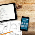
Mobile technology is a fact of life. In the United States, there are more active cell phones than people—and more than 129 million of them are smartphones. One in three American adults, or around 83 million, owns a tablet.
And all of those people could be reading your blog, if you optimize it for mobile viewing.
Optimizing for mobile means changing the format of your blog when it’s accessed through a mobile device, so that it’s easier to read and navigate from a smaller screen. This may sound like a complicated process, but it’s actually a built-in feature for most major blogging platforms and takes just a few minutes to do.
Mobile Optimization on WordPress
If you use WordPress.com, your blog may already be mobile-optimized. It’s the default setting for most WordPress templates. To find out, log into your dashboard and select Appearance, then click on Mobile. You’ll see the Mobile Options page, with a list of selectable options for mobile features.
For blogs built on WordPress.org, the process is the same, but you may need an extra step to optimize for the iPad. From your dashboard, navigate to Appearance > iPad, and then check the box that activates an iPad theme when a visitor uses the device. If your site does not currently have this iPad enabling option and you are interested in taking advantage of this feature, you may want to download the newest version of WordPress.
You can also gain more control over the mobile appearance of your blog with a WordPress plug-in that lets you customize the mobile user experience. Two of the most popular are WPTouch and MobilePress. Alternatively, you can install Jetpack for a quick and easy mobile version for your blog.
Mobile Optimization on Blogger
While optimizing your blog for mobile on the Blogger platform is not the default setting, it’s still fairly easy to accomplish. Just log in to your dashboard and go to Settings > Email & Mobile, and activate the mobile template option.
Another way to handle it: From your dashboard, hover the mouse over the notepad icon and click on Template from the drop-down menu. On the Template page under Mobile, click the gear icon for a pop-up window that will present you with mobile templates to choose from.
Mobile Optimization on Joomla
The Joomla platform doesn’t have a mobile enabling feature built in, but you can use a plug-in similar to the WordPress options to customize your blog experience for mobile users. It’s called Mobile Joomla!, and it automatically adjusts the display for iOS, Android, Windows, and all other smartphone operating systems.
More Tips for Mobile Blog Optimization
There are a few basic design steps you can take that will make your blog more mobile-friendly, and overall more readable no matter how your visitors are accessing you. Consider:
- Removing Flash elements from your pages, which don’t work well with mobile interfaces (and can be distracting or annoying for any reader)
- Increasing your blog’s body font size to 14 points, and line spacing to 1.5
- Ensure that your navigation elements are well spaced to avoid crowding
- Minimize drop-down menus wherever you can, since they’re almost impossible to use on smaller screens
With a mobile-friendly blog, you can increase your visitors and your readership by appealing to the millions of people who are looking for great content to read on their smartphones or tablets. Happy mobile blogging!
Image courtesy of Serge Kij
Related Posts
 How to Develop a Mobile Content Strategy
 Ad Intelligence: Advanced Keyword Research Tool
 The 2000 Twitter Following Limits
 Is WordPress Better For SEO than Blogger?
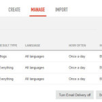 Talkwalker Alerts, Traffic Generation Via PDF, AdSense Optimization, Speedlink 13:2013
 Google Page Rank Updated
 Pinterest Jumps on the Ad-wagon with Promoted Pins
 Simple Tips To Make Your SEO Company Stand Out Among the Rest
Comments are closed.